The Power of Showing: How previews can be used to drive user confidence.
How Expedia can use previews as a tool to bridge the gap between Expedia’s partners and travelers interested in their properties.
My Expedia Group UX Design internship experience.

DURATION
Summer 2023 (Five weeks)
ROLE
Solo Designer
TOOLS
Figma, Miro
Summer 2023 (Five weeks)
ROLE
Solo Designer
TOOLS
Figma, Miro
OVERVIEW
Expedias partners wanted a way to better understand how travelers were interacting with their listing through previews. Last summer, I explored where this need was coming from and how to address it in order to drive a partners confidence in their listing.
Expedias partners wanted a way to better understand how travelers were interacting with their listing through previews. Last summer, I explored where this need was coming from and how to address it in order to drive a partners confidence in their listing.
INTRODUCTION
My Team
Over the summer of 2023, I had the pleasure of joining Expedia Group in Seattle as a UX Design intern, working towards their mission of powering global travel through technology. As a member of the Marketplace Ready team, I worked on creating onboarding experiences that help Expedias partners (airlines, hotels, vacation homes, cruise lines and car rental companies) set themselves up to succeed within the travel marketplace serving millions of travelers around the globe.
CONTEXT
The Power of Previews

Creating a representation of a product or service to post to an online marketplace can come with a lot of guess-work about how your potential customers will interact with it. Because of this disconnect, it’s imperative that you know what your customers are looking for and how to tailor to them. Understanding their needs and expecations can take a lot of work to identify so how can the listing tool itself help you bridge that gap?
This is exactly what I explored at Expedia Group last summer. There had been a long history of Expedia’s partners asking for a way to get a better understanding of what their property listing looks like from a travelers point of view using some type of preview feature.
My goal was to explore implementation strategies for using previews as a tool to bridge the gap between partners and travelers interested in their properties.
Building an understanding of the user needs.
When listing their properties, the primary goal of partners is to craft their listing in a way that presents their property in the best light for travelers. In order to get closer to this goal, parters have requested some type of preview element throughout their user journey as detailed below.

PROCESS
Secondary research opened up a wide range of design opportunities...

I started with this exploration first by gathering as much understanding about the problem space as I could by engaging in some cross-team collaboration and secondary research. Through this, I was able to chip away at the two big questions driving this entire project:
Why do partners want previews?
What needs aren’t being met by not having previews?
Framing research by facilitating collaborative ideation.
With primary research questions now identified, I facilitated a traveler preview exploration workshop with a group of designers and product managers. My primary goal was to present my research findings to then support the group creation of “How Might We” statements and exploring a range of use cases through a Crazy 8’s activity.
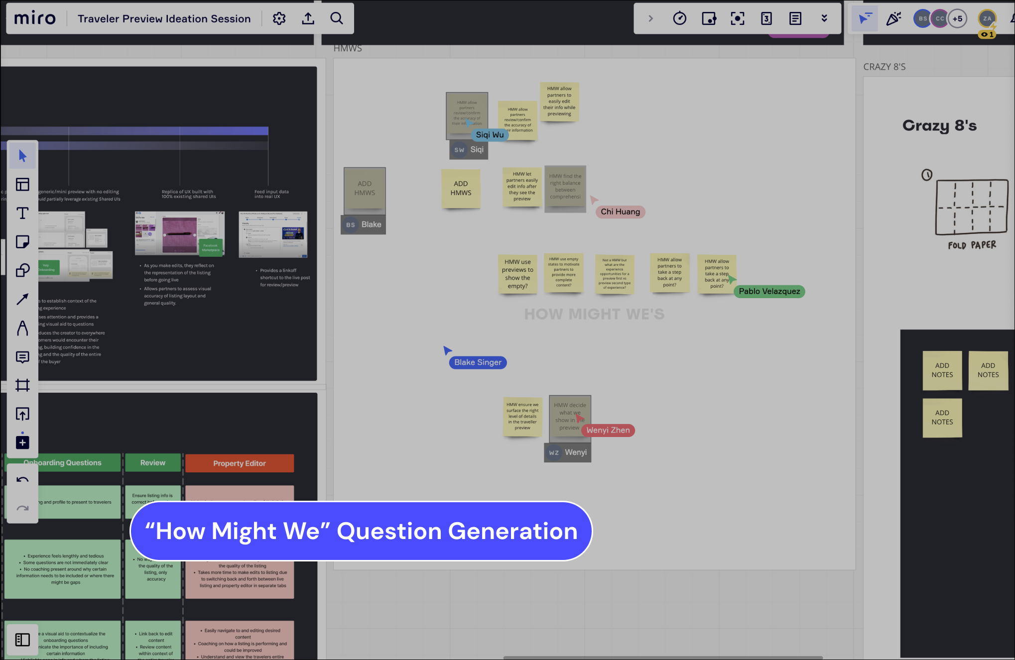

After distilling the outcome of the workshop, four key categories of needs arose with HMW question guiding the further exploration of design solutions.

Design exploration and refinement
Using the ideas generated from the workshop, I began sketching out low-fidelity design solutions and categorized them based on a variety of spectrums to determing the optimal configuration of previews that met our goals.
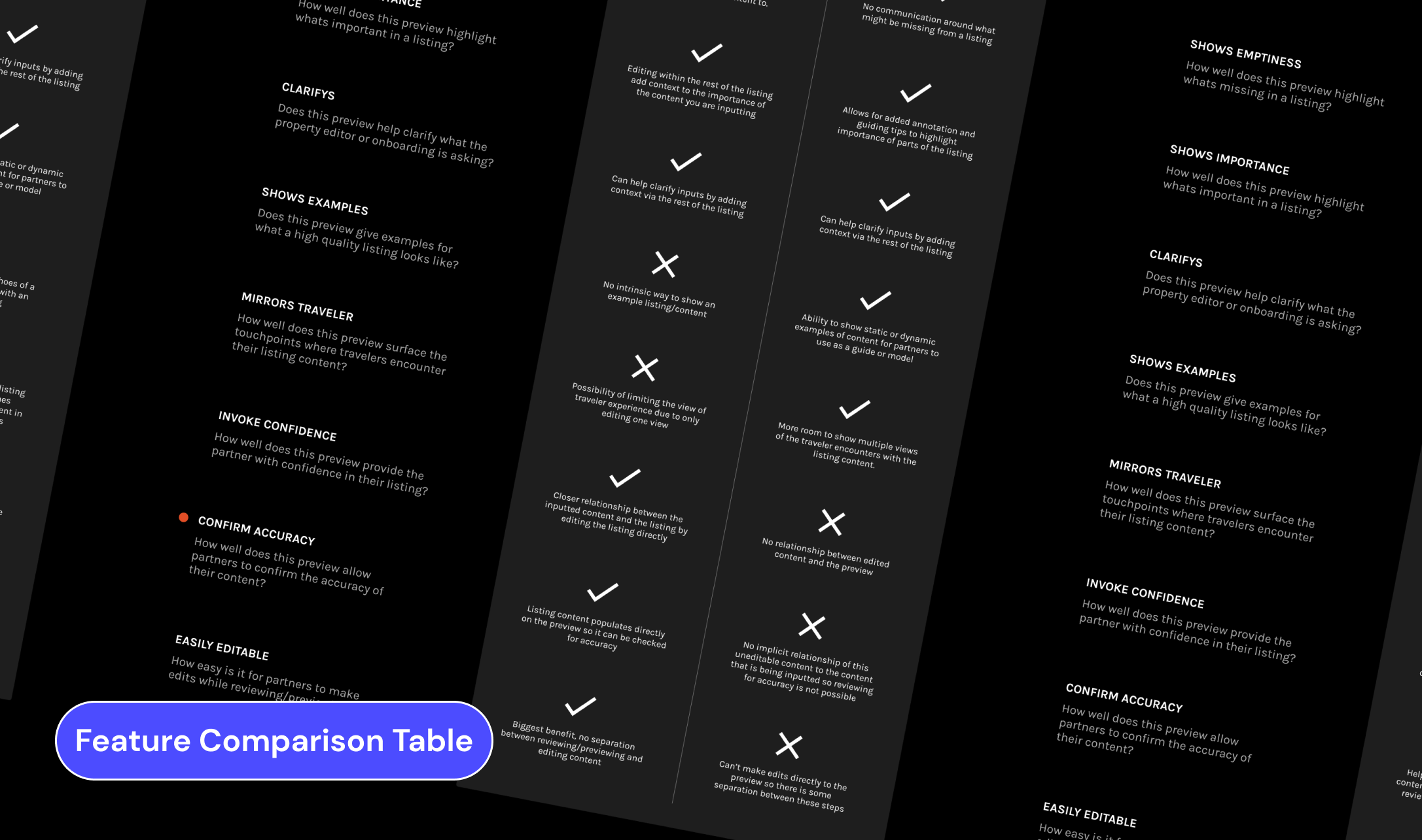
I then got input from product, engineering, researchers, and other designers to judge each preview implementation on a set of goal criteria, helping to reframe and refine user needs and goals addressed by each.

All of the feedback and design explorations came together to produce a Jobs to Be Done framework to support the creation of a roadmap to incrementally build towards an preview experience. Based on discussions with product teams, it was identified that the listing review stage had the most potential for business impact with listing setup being placed as next in the pipeline.

STAGE ONE
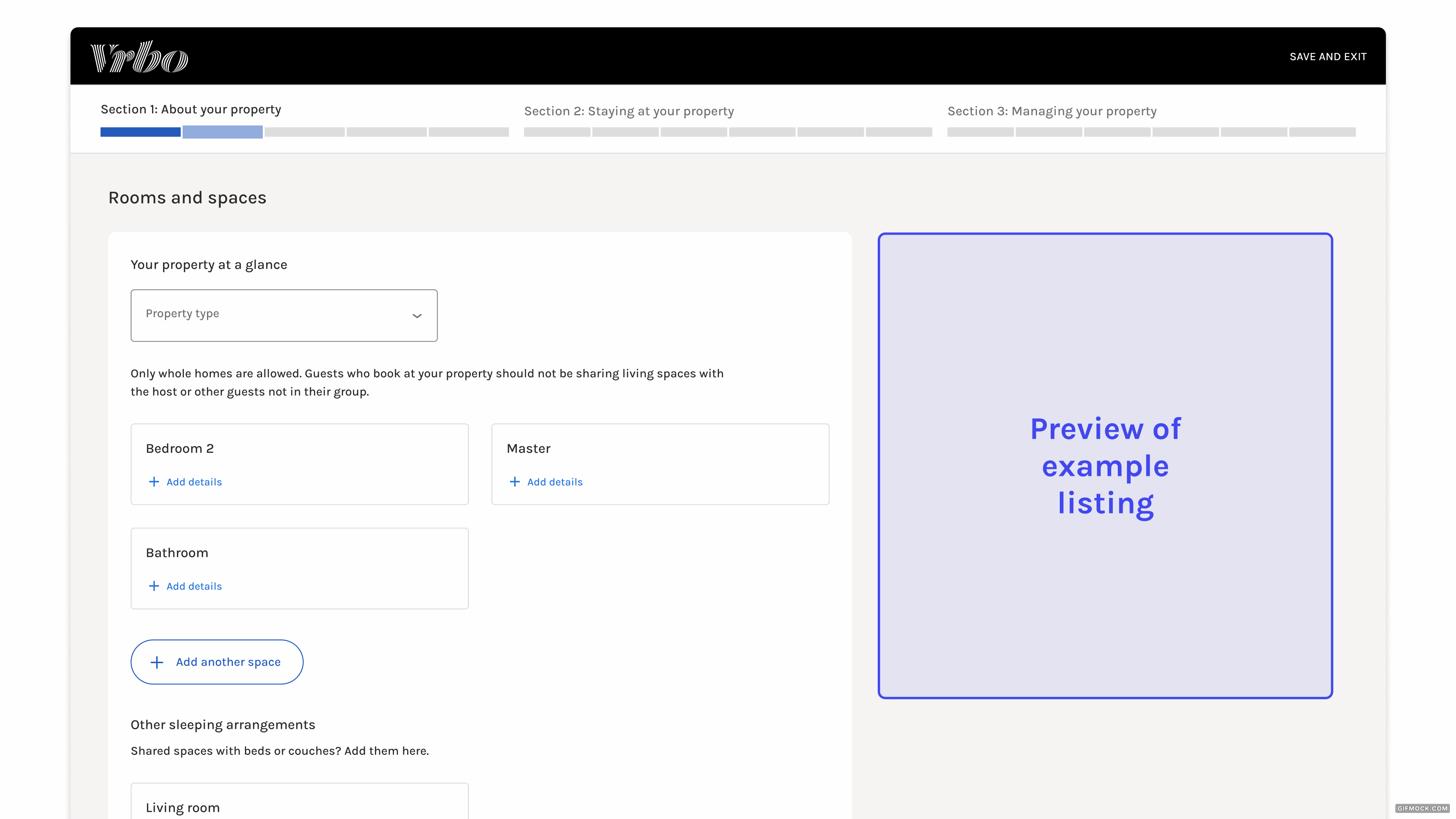
Setting up a listing.
This stage includes the onboarding and listing creation flow that partners go through when setting up their profile and new listing. The goal of previews at this stage is to supplement and inform the listing creation process. To accomplish this the preview must:
- Communicate what makes listings successful
- Show examples of high quality listing content to reference
- Contextualize the onboarding questions
- Communicate and manage expectations for the rest of the listing experience
Design Recommendation: For a guided experience that focuses on coaching, provide mini annotated previews of existing high performing listings.
STAGE TWO
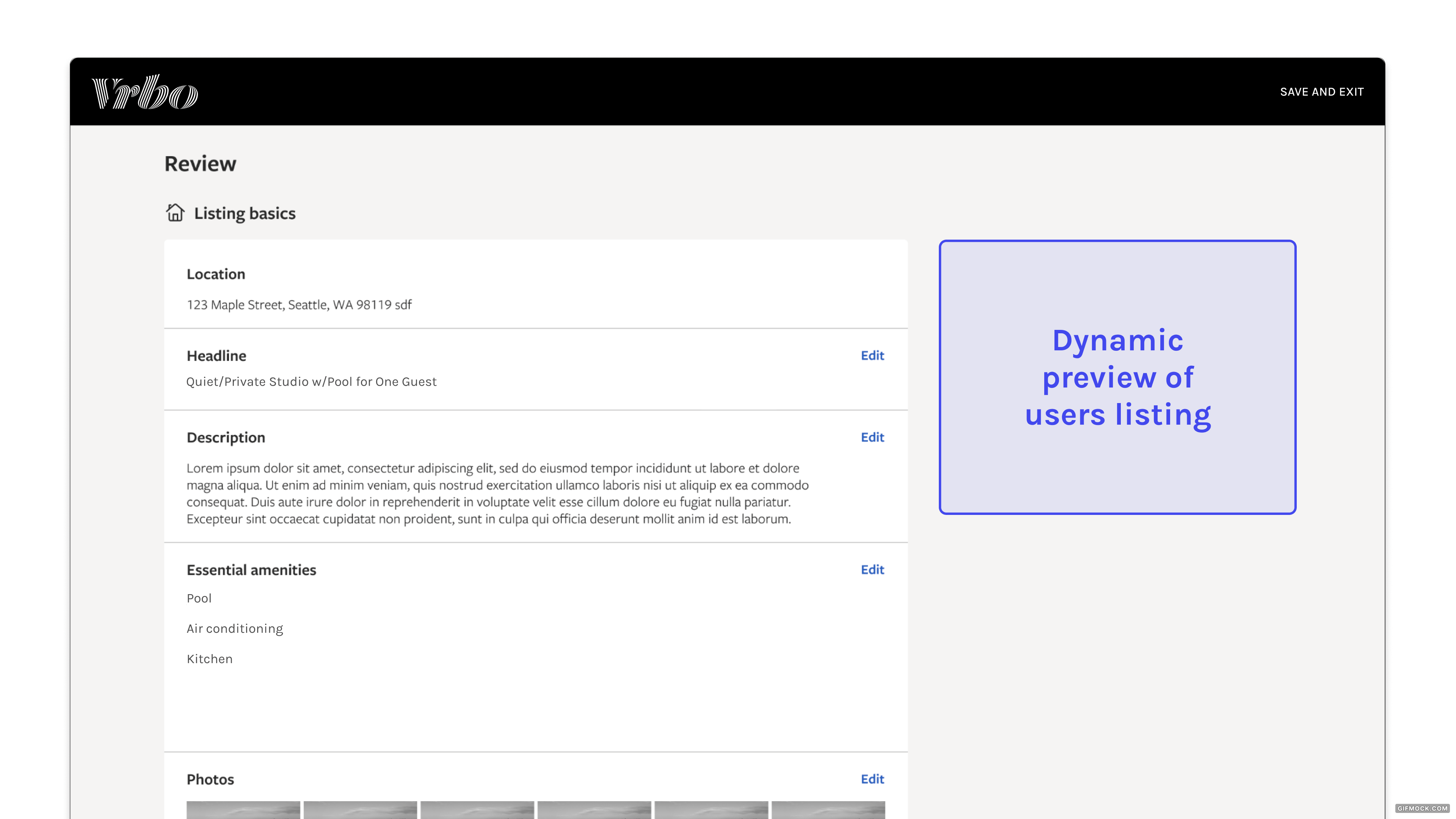
Reviewing a listing.
This stage includes the overview screen at the end of the listing creation flow. This is where partners review and confirm all of the information that they included in their listing. The goal of previews at this stage is to highlight gaps and opportunities in listing content. To accomplish this the preview must:
- Allow partners to “play traveler” by interacting with their own listing from a travelers pov
- Allow partners to review the accuracy of listing content in context
- Flag any missing content by showing the impact that emptiness makes
- Make it easy to link back to onboarding questions to make any edits as need be
Design Recommendation: To review listing content at the end of onboarding, present in the form of a full listing preview that links back to onboarding questions to make edits.
STAGE THREE
Maintaining a listing.
This stage includes the portal called partner central where users are able to make edits or updates to their listing once it’s already live. The goal of previews at this stage is to see listing edits reflected from the perspective of a traveler. To accomplish this the preview must:
- Address any discrepancies between the traveler perspective and the partners editing experience
- Minimize steps partner has to make between editing listing content and referencing previews
- Communicate how the listing appears in different contexts (mobile vs desktop, full page listing vs card, differing brands etc)
- Give partners active feedback on how they can make their listing better
Because partner central was going through a total design upheaval at the time of working on this project, I decided against formulating a design recommedation for this stage.
Reflecting on my time at Expedia...
From hosting my first ideation workshop to proposing design solutions to 100+ multidisciplinary designers across the company over the course of the summer, this internship pushed me in more ways that I could have imagined. With this exploratory of a project, there were several loose threads and next steps that I would have loved to have more time to follow through with:
Addressing Gaps: I had the opportunity to meet with the traveler engineering team to identify technical blockers early on in the ideation process. I would have loved to present my findings to them to get their insight on where best to prioritize preview implemention and what specific technical blockers might need to be considered at those stages.
Prioritization: While I did meet with several product managers throughout this exploration and got their insight that the review stage would provide the most business impact, I would have liked to seek and visualize more of these specific business leads to better communicate my reasoning for the proposed roadmap.
Validate: Lastly, while I was able to create some quick mid-fi mockups for design proposals, I would have loved to develop a more fleshed out MVP preview to test with partners based on measurable desired outcomes.